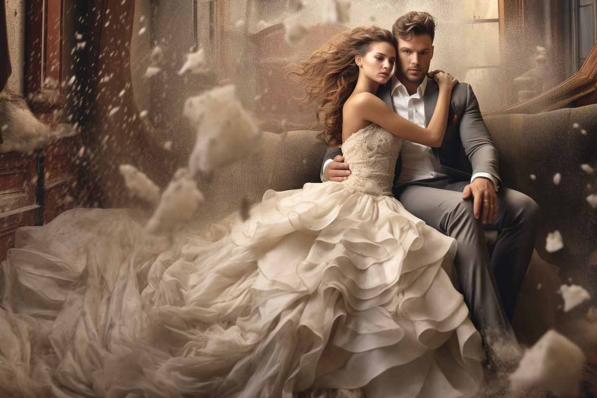
Wedding galleries don’t fail because the photos are bad. They fail when the editing takes too long, the color shifts from room to room, and the final set looks inconsistent from the first dance to the exit.
Quick Answer
Lightroom wedding photo editing is the fastest way to turn a large wedding gallery into a consistent, polished delivery when you start with a preset, then fine-tune exposure, white balance, and skin tones image by image. The best results come from RAW files, lighting-specific preset variants, and a repeatable workflow that speeds up editing without flattening your style.
Quick Procedure
- Import RAW files and cull the keepers.
- Apply a base preset to a representative image.
- Adjust exposure, white balance, and skin tones.
- Sync the corrected settings to similar images.
- Refine highlights, shadows, and color for problem frames.
- Save custom variations for daylight, indoor, and reception scenes.
- Export the gallery and review for consistency.
| Primary workflow | Lightroom wedding photo editing |
|---|---|
| Best starting file type | RAW for maximum highlight and color recovery |
| Main advantage | Faster batch editing and more consistent gallery styling |
| Best preset use | As a base look, not a final finish |
| Common preset styles | Light and airy, moody, classic, black-and-white |
| Best fit for | Wedding portraits, ceremonies, receptions, and mixed lighting |
| Freshness note | Workflow recommendations updated as of August 2026 |
What Wedding Presets Are and Why They Matter in Lightroom
A Lightroom preset is a saved set of editing settings that you can apply to a photo in seconds. It can include exposure, contrast, tone curve, color treatment, sharpening, and more, which makes it much more flexible than a simple filter.
That flexibility is the real reason photographers use adobe lightroom wedding presets. A preset gives every image a starting point, but you still control the final look. In wedding work, that matters because a bride’s getting-ready photos, a ceremony in open shade, and a reception under tungsten lights should not be edited the same way.
“A preset should save time, not remove judgment.”
For wedding photography, presets matter because they help create a cohesive gallery. Couples expect one story, not a collection of unrelated edits. When the color, contrast, and tone stay consistent across hundreds of images, the entire album feels intentional.
The time savings also scale quickly. If you edit 600 to 1,200 images per wedding, even cutting one minute per file saves hours. That is why many photographers build their workflow around a small set of reliable presets instead of trying to reinvent every frame.
Official Lightroom guidance from Adobe Help Center confirms that presets are meant to speed up repetitive work while still allowing manual adjustments. For photographers who want a cleaner, faster workflow, that is exactly the point.
Preset versus filter
A preset is not the same thing as a social media filter. A filter usually applies a fixed look with little room for correction, while Lightroom lets you modify the image after the preset is applied.
- Preset: Editable, layered into Lightroom’s full toolset, and suitable for professional workflow.
- Filter: Usually a one-click effect with limited control and weaker consistency across files.
If you want better wedding gallery consistency, presets are the stronger choice. They are designed for controlled refinement, which is what wedding editing actually requires.
What Do Wedding Presets Actually Control?
Wedding presets can control nearly every major part of the Lightroom edit. The most useful adjustments are exposure, contrast, highlights, shadows, white balance, vibrance, saturation, tone curve, sharpening, noise reduction, grain, and vignette.
Each control affects the image in a different way. Exposure sets the overall brightness, while the tone curve shapes contrast in a more nuanced way than the basic slider. White balance is especially important because skin tone problems show up fast in wedding photos, especially when the venue mixes daylight, flash, candles, and tungsten bulbs.
Note
If a preset makes skin look orange, green, or gray, it is not helping your workflow. A good wedding preset should improve the image without forcing you into constant recovery work.
Color controls are equally important. A strong preset can mute distracting greens in outdoor portrait locations, remove harsh yellow from indoor lighting, and keep dresses clean white without crushing detail. For example, a reception hall with blue uplights may need a different color response than an outdoor ceremony in bright afternoon sun.
Creative controls like grain and vignette are useful when used carefully. Grain can soften digital sharpness and add a film-style texture, while a subtle vignette helps guide attention to the couple. Push either too far and the photo starts to feel artificial, which is a common mistake in lightroom wedding photo editing.
What a strong preset should do
- Improve the image quickly without breaking skin tones.
- Reduce the number of manual edits per file.
- Stay flexible across different venues and lighting setups.
- Keep the final gallery visually unified.
Why Do Wedding Presets Speed Up the Editing Workflow?
Wedding presets speed up editing because they remove repetitive decision-making. Instead of starting every image from zero, you begin with a tested look and make only the corrections that matter for that specific frame.
This is especially valuable when you are processing large galleries shot in similar conditions. A ceremony sequence, for example, may contain dozens of near-identical exposures from the same angle and light source. Applying one base preset and syncing it across the group can save a significant amount of time.
That time savings matters most during the parts of the day that produce volume. Reception candids, dance floor shots, cocktail hour, and family groupings often arrive in clusters. If the lighting is consistent, a preset can move those images from raw capture to deliverable faster than manual edits ever could.
“Batch editing works best when the lighting is stable and the preset is built for that exact situation.”
There is also a culling advantage. When you apply a base look early, it becomes easier to judge which frames are worth keeping. A properly edited preview can reveal whether an image has good color, enough detail, and acceptable exposure before you invest more time in fine-tuning.
The key is to reserve your manual time for the frames that need it most: the hero portrait, the first kiss, the family formals, and the emotional details that will matter to the couple for years. Adobe explains this workflow approach in its Lightroom Classic preset documentation, and it matches how most efficient wedding editors work in practice.
How Do You Use Wedding Presets the Right Way?
The right way to use a preset is to treat it as a foundation, not a final edit. Apply the preset, inspect the image closely, then correct exposure, white balance, highlights, shadows, and skin tone before syncing the result to similar images.
RAW files are the best starting point. They preserve far more tonal and color information than compressed JPEGs, which gives you room to recover blown highlights in dresses, rescue dark reception images, and refine complex skin tones without artifacts. That flexibility is especially important when the lighting changes every few minutes.
- Import the RAW files. Keep your source files intact so you can recover detail and color accurately.
- Apply the preset to a representative image. Choose a photo shot under the same light as the rest of the set.
- Correct white balance and exposure. Use these two controls first because they affect the entire image.
- Check skin tones before anything else. Wedding photos live or die by flattering, natural-looking skin.
- Sync to similar frames. Apply the corrected settings to images from the same lighting scenario.
- Finish with local adjustments. Use masks, brushes, and graduated filters for difficult files.
A common mistake is applying the same preset to a daylight portrait, an indoor ceremony, and a flash-lit dance floor image. That usually creates extra work, not less. Matching the preset to the lighting conditions is what turns it into a real workflow accelerator.
Professional editing guidance from Adobe Lightroom Classic Help reinforces that global adjustments should come before local corrections. That order saves time and keeps the edit cleaner.
Which Wedding Style Should You Choose?
Wedding style is the visual direction your preset supports, and the main choices are light and airy, moody, and classic. Each one changes how brightness, contrast, and color are handled across the gallery.
Light and airy editing lifts shadows, softens contrast, and leans into bright, romantic color. It works well for outdoor ceremonies, spring weddings, and venues with clean natural light. The risk is that overexposure can make dresses look flat and wash out skin if the preset is too aggressive.
Moody editing uses deeper blacks, richer color, and more controlled highlights. It can create a cinematic feel that works well in dramatic venues, darker interiors, or late-evening reception coverage. The risk is that shadows can hide detail in dresses, suits, and background decor if you push the look too far.
Classic editing sits in the middle. It focuses on accurate color, balanced contrast, and clean skin tones, which makes it easier to keep a broad client appeal. This is often the safest style for photographers who want their portfolio to age well and their galleries to remain versatile.
| Light and airy | Best for bright venues, soft romance, and soft contrast |
|---|---|
| Moody | Best for deeper tone, dramatic light, and cinematic mood |
| Classic | Best for balanced color, natural skin, and timeless delivery |
Your venue, wardrobe, season, and brand identity should guide the preset choice. A summer garden wedding with pastel florals usually benefits from a different edit than a candlelit indoor ceremony. Choose a style that supports the story, not just one that looks good on a sample image.
How Do You Match Presets to Different Lighting Conditions?
Lighting condition matching is the difference between a preset that works and a preset that creates cleanup work. Outdoor daylight, overcast skies, window light, tungsten bulbs, flash, and mixed reception lighting all affect color and contrast in different ways.
Golden-hour portraits often need less correction because the light is already warm and flattering. In that case, a preset may only need a small exposure tweak and a slight reduction in highlights. Overcast ceremonies, on the other hand, can look flat without contrast shaping or a mild lift in vibrance.
Indoor receptions are the hardest situation. You may be dealing with tungsten chandeliers, DJ lights, dark corners, and flash all in the same room. That is where one preset should become a family of variations, not one universal setting.
Pro Tip
Create separate preset variations for daylight portraits, indoor ceremony work, and reception flash. That small organization change saves far more time than trying to force one look across the entire day.
RAW editing gives you the latitude to recover white dresses, correct mixed color casts, and refine skin tones when the light changes rapidly. If you want a more technical reference on color and tonal control, the Adobe basic adjustments guide is still one of the clearest official references available.
This is also where many searches for lightroom presets download hd 1080p free download go wrong. A free download is only useful if it matches your lighting and your output needs. Otherwise, it is just another file that creates cleanup work.
What Mistakes Do Photographers Make with Wedding Presets?
The biggest preset mistake is overediting. If contrast is too high, saturation is too strong, or clarity is pushed too far, skin starts to look harsh and fake. Wedding clients notice that instantly, even if they cannot explain exactly what feels off.
Another common problem is applying one preset identically to every photo in the gallery. That might seem efficient, but it usually creates a mismatch between scenes. A preset built for an outdoor portrait will rarely behave well in a dim reception hall.
Some photographers also rely on presets to define their entire style. That leads to generic galleries that do not feel personal. A preset should reinforce your brand, not replace it.
- Overediting: Too much contrast, saturation, or sharpening.
- Blind syncing: Copying one edit to every photo without checking light differences.
- Wrong source files: Starting with low-quality JPEGs instead of RAW files.
- Weak review process: Failing to check the full gallery for tone consistency.
- Preset dependence: Treating the preset as the final edit instead of a starting point.
Be careful with files labeled as persets or other misspelled downloads from random sources. A typo alone is not the issue; the issue is that files from questionable sources often do not match your camera profile, your light source, or your delivery style.
There is also no reason to treat pre set up style edits as automatic wins. A clean workflow is built on judgment, not on blindly trusting a file because it says “wedding” on it.
How Do Wedding Presets Improve the Client Experience?
Client experience improves when the gallery looks intentional, the turnaround is faster, and the final images feel like one cohesive story. That is where presets pay off beyond the editing desk.
Couples usually do not care how many hours you spent in Lightroom. They care about whether their photos look polished and whether they receive them on time. A reliable preset workflow helps photographers deliver consistent work faster, which usually translates into better reviews and fewer revision requests.
“Fast editing matters only when the final gallery still looks carefully crafted.”
Polished galleries also improve perceived value. A cohesive visual style makes the coverage feel more premium, even if the photos were taken in mixed lighting or under a tight schedule. That consistency gives the client confidence that the story was handled professionally from start to finish.
The pressure is real during peak wedding season. Faster Lightroom work reduces stress, gives you room for color checks before delivery, and makes it easier to keep promised turnaround times. It also supports referral business because clients tend to recommend photographers whose galleries look polished and arrive on schedule.
For workload context, the U.S. Bureau of Labor Statistics notes that photographers are expected to keep needing stronger digital workflow skills, and wedding work remains a high-volume editing discipline. For broader job outlook reference, see the BLS Photographers occupational outlook.
How Do You Build a Sustainable Lightroom Wedding Editing Workflow?
A sustainable workflow is one you can repeat without burning out. The cleanest structure is simple: cull first, apply a base preset second, refine key images third, then export and review the full gallery for consistency.
That order matters because it keeps your decisions organized. If you spend time perfecting an image before you know whether it belongs in the final set, you waste effort. If you cull first, you only spend real editing time on the frames that matter.
- Sort the gallery. Remove duplicates, blinks, and blurred frames before you start editing.
- Group by lighting. Separate portraits, ceremony, reception, and detail shots.
- Apply lighting-specific presets. Use the closest preset match for that scene.
- Save custom variations. Keep versions for daylight, indoor, black-and-white, and flash.
- Refine signature frames. Spend extra time on the images that will define the gallery.
- Review the full export. Check for color shifts, odd skin tones, and inconsistent contrast.
Organizing presets by use case is one of the simplest ways to speed up lightroom wedding photo editing. When a deadline is tight, you should not have to search through a messy folder of half-remembered looks. A clean preset system is a productivity system.
According to official guidance from Adobe, presets can be created and stored for repeated use, which makes them ideal for this kind of repeatable workflow. That is why experienced editors build a small set of reliable looks instead of depending on one oversized preset pack.
How Do You Know Whether a Wedding Preset Is Actually Working?
A working preset makes you faster without causing more correction work later. If a preset looks impressive on one portrait but creates extra fixes on every other image, it is not helping your workflow.
Test presets across multiple lighting conditions before you trust them on a live job. A good preset should hold skin tones reasonably well in daylight, indoors, and mixed light. It should also preserve detail in white dresses, black suits, and dark reception corners without constant rescue edits.
Comparing only one perfect image is misleading. The real test is whether the preset can survive a full wedding day. That means checking portraits, ceremony, family formals, reception candids, and detail shots before you decide the preset belongs in your core workflow.
- Speed: Does it reduce editing time or create extra cleanup?
- Skin tone quality: Does it keep people looking natural and flattering?
- Color consistency: Does it behave well across different venues and times of day?
- Brand fit: Does it match the look you want clients to recognize?
- Revision load: Are you spending less time reworking finished files?
Warning
If your preset only looks good after heavy correction, it is not a preset that saves time. It is just a starting point with too many hidden problems.
One practical test is simple: edit a 20-image sample from different parts of the wedding day, then measure how many images need major correction afterward. If the number is high, the preset is not ready. If the gallery looks cohesive and you only need small refinements, it is doing its job.
Key Takeaway
- Lightroom wedding photo editing is fastest when presets are used as a starting point, not a final result.
- RAW files give you the flexibility needed to recover highlights, fix color casts, and refine skin tones.
- Lighting-specific preset variations work better than one universal look for every image in a wedding gallery.
- Skin tone accuracy should be checked first because wedding clients notice unnatural color immediately.
- A strong preset workflow saves time, improves consistency, and supports a better client experience.
Conclusion
Wedding presets are valuable because they remove repetitive work, not because they replace editing skill. Used properly, they help you move through large galleries faster, keep color consistent, and deliver a more polished final set.
The best approach is straightforward: start with RAW files, use a preset as the base, adjust for the actual light, and save variations for different wedding scenes. That workflow keeps your editing efficient without turning every gallery into the same generic look.
If you want better results from adobe lightroom wedding presets, focus on consistency, skin tones, and lighting-specific adjustments. Build a repeatable system, test it against real wedding conditions, and refine it until it supports your brand instead of fighting it.
For photographers looking to tighten their workflow, ITU Online IT Training recommends treating presets as production tools, not shortcuts. That one change can save hours and improve the quality of every gallery you deliver.
Adobe® and Lightroom are trademarks of Adobe Inc.
